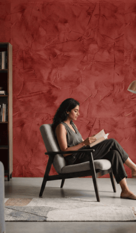
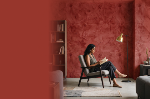
Shades of Orange Colour for Walls
Orange adds warmth to a room, but each shade creates a different effect. When choosing orange wall paint, consider room size, sunlight, furniture and flooring. A colour catalogue can help compare close shades easily. Test the selected orange colour for the wall in different lighting before painting.
Lighter tones suit compact spaces, while deeper shades work well on a single wall. Before buying, note the shade code and view the sample on more than one wall, since direction affects the colour throughout the day.
Apricot
Apricot has a gentle warmth that feels friendly rather than loud. It suits living rooms, bedrooms and passage areas where a soft welcoming mood is preferred.
This light orange wall paint works with cream, pale wood, beige and muted green. It can also make a compact room feel comfortable without adding too much visual weight.
Rustic Orange
Rustic orange carries an earthy, aged quality that pairs naturally with wooden furniture, cane details and neutral fabrics. It works well in living rooms, dining spaces and traditional interiors.
Keep the remaining interior wall paint simple so the shade remains the focus. Warm white or sand tones can support its depth without making the setting feel overly dark.
Coral Orange
Coral orange mixes orange warmth with a noticeable pink influence. The result feels fresh, bright and suited to informal living spaces, bedrooms or creative corners.
Use it where the room receives balanced natural light. White, pale peach or soft grey can help coral look clean, while green accessories provide a lively contrast.
Terracotta
Terracotta gives walls a natural, sun-baked character. It can bring warmth to living rooms, dining spaces and covered patios. The shade works especially well beside stone, clay, wood and handwoven materials.
When using it outdoors, select exterior wall paint intended for changing weather rather than applying an interior finish to an exposed surface.
Burnt Orange
Burnt orange is deeper and more restrained than brighter orange shades. It adds richness to feature walls, home offices and contemporary rooms. Pair it with charcoal, beige or warm white for balance.
A textured finish can add further depth, though modern texture paint designs should be sampled first because surface patterns affect how the colour catches light.
Orange Colour Combination Wall Paint
A second colour can soften, sharpen or cool orange. Good orange colour combination ideas begin with deciding which shade will lead and how much wall area each colour should cover. The final orange wall paint colour should also suit the room’s purpose.
Orange and Yellow Colour Combination
Orange and yellow create a cheerful palette filled with warmth. The pairing suits kitchens, dining rooms and active family areas. Choose one shade as the main colour and use the other in a smaller section.
Softer yellow can make strong orange easier to live with, while white helps separate the two warm tones.
Orange and Blue Colour Combination
Orange and blue balance warmth with calmness. Orange feels energetic, while blue brings a cooler and more restful note. This contrast can suit bedrooms, lounges and modern living rooms.
Muted blue works well with burnt orange, whereas a lighter blue can complement apricot or coral. Always compare both samples in the same light.
Orange and White Colour Combination
Orange and white give interiors a clear, bright appearance. White reduces the intensity of orange and makes the overall arrangement feel more open.
This combination works well in compact rooms, kitchens and living areas. Use white on ceilings and larger walls, then place orange where you want warmth and attention.
Orange and Brown Colour Combination
Orange and brown create an earthy palette that feels settled and comfortable. The combination suits living rooms, studies and rustic interiors, particularly when wood is already present.
Lighter brown can support vivid orange, while chocolate tones pair better with apricot or terracotta.
Orange and Red Colour Combination
Orange and red create a bold, connected scheme inspired by warm sunset tones. It can suit dining spaces, creative rooms and carefully planned feature walls.
Add a pale neutral to provide visual rest. A colour finder can help you compare related orange and red shades before selecting a combination that feels balanced in the room.
Find Your Perfect Orange Shade with Berger Paints
The best orange scheme is one that remains pleasant through changing light and daily use. Compare shade codes, preview the palette and test a sample on the wall.
Once you have decided how much area each colour will cover, use a paint calculator to estimate the required quantity. Thoughtful planning allows orange shade to feel warm and expressive without becoming tiring or difficult to coordinate.