Types of Red Paint for Walls
Red brings warmth, depth and character to a room, making the choice of shade important for the overall look. Before choosing red wall paint, note the room size, available daylight, furniture and the feeling you want to create.
A colour catalogue can help you compare related tones instead of judging one sample alone. Test the shortlisted shade on a small area as the red wall paint may appear deeper in evening light than it does during the day.
Maroon
Maroon has a grounded, mature quality that suits living rooms and dining spaces. It adds warmth without carrying the sharp brightness of pure red. Use it on one main wall when the room receives enough natural light, then balance it with beige, cream or warm wood.
People exploring maroon colour combination Ideas can also pair it with muted gold details for a more formal setting.
Burgundy
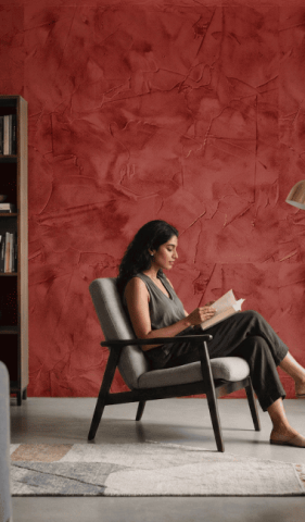
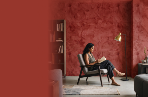
Burgundy creates depth and a sense of timeless elegance. It works well in formal sitting rooms, reading corners and feature wall arrangements. Since it is a dark shade, the surrounding interior wall paint should usually remain lighter.
Soft cream, pale grey or off-white can keep the room from feeling heavy while still allowing burgundy to hold attention.
Rose Pink
Rose pink sits on the softer side of the red family. It brings calmness and warmth to bedrooms, nurseries and cosy corners without making the space feel too intense. This shade is especially useful in compact rooms that need a gentle touch. Pair it with white ceilings, light wood and simple fabrics to maintain an airy finish.
Cherry Red
Cherry red gives a room a lively and confident character. It can suit entertainment areas, dining spaces and selected accent walls where visual energy is welcome. Rather than covering every wall, use it in a measured way.
A colour finder can help distinguish brighter cherry tones from deeper red wall paint colours before you settle on the final option.
Scarlet
Scarlet is bold, warm and immediately noticeable. It is best used where a strong focal point is needed, such as behind a sofa, television unit or display shelf. The shade can also work within modern texture paint designs when the texture remains controlled. Keep the rest of the palette quiet so the wall looks intentional rather than overpowering.
Red Colour Combination Wall Paint
The most successful red combinations balance its warmth with a second colour that changes how the room feels. Consider light, scale and the amount of red being used before finalising red paint colours for walls.
Red and White Colour Combination
Red and white form a crisp, lasting combination. White reduces the visual weight of red and keeps rooms brighter, while red adds character.
This pairing works well in kitchens, living rooms and modern interiors. Use white across larger surfaces and reserve red for a feature wall, niche or selected architectural detail.
Red and Blue Colour Combination
Red and blue offer contrast without losing balance. Red contributes warmth and movement, while blue creates a calmer visual pause.
Deeper versions can suit lounges, while softer blue with muted red may work in bedrooms. Review both shades together under actual room lighting before painting.
Red and Yellow Colour Combination
Red and yellow produce a cheerful, energetic setting. They are suitable for dining rooms, kitchens and family areas where conversation and activity are encouraged.
Avoid using both at full strength across every wall. One can remain dominant while the other appears through a smaller section or furnishing.
Red and Brown Colour Combination
Brown softens the intensity of red and gives the palette a warm, earthy character. This combination pairs naturally with wooden furniture and can suit studies, living rooms and traditional interiors.
Deep red works well with chocolate brown, while muted red can be balanced with lighter brown or beige tones.
Red and Orange Colour Combination
Red and orange sit close together on the colour wheel, creating a warm and connected look. They suit family rooms, creative spaces and contemporary interiors. Break up the warmth with cream, pale beige or natural materials.
For outdoor use, choose an exterior wall paint made for the surface and local weather conditions.
Red and Black Colour Combination
Red and black create a dramatic, confident result. The pairing is most effective in limited areas such as entertainment rooms or feature walls.
Add enough neutral space and lighting to prevent the room from appearing closed. In red colour rooms, black should usually support the red rather than compete with it.
Bring Your Walls to Life with the Perfect Red Shade from Berger Paints
A considered red scheme begins with observing the room, comparing shades and testing the final choice. Once the colour placement and wall measurements are confirmed, use a paint calculator to estimate the required quantity.
Digital previews, physical samples and the correct colour code can support accurate planning. The right balance can make red feel welcoming, expressive and suitable for everyday living.