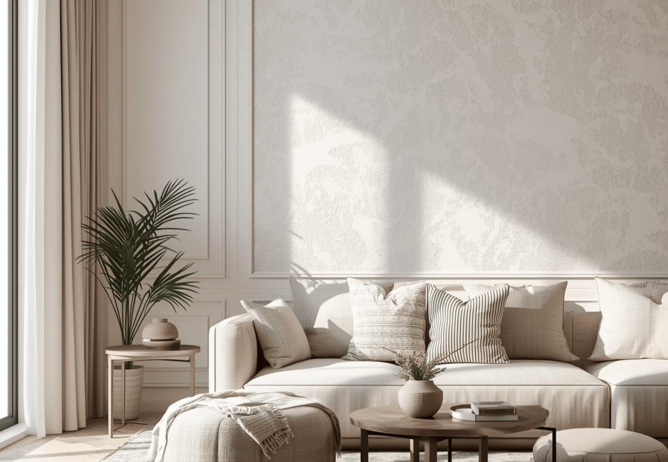
An off-white wall colour combination works beautifully in Indian homes because it feels soft, bright, and easy to live with. Gentler than pure white and less trend-driven, it suits both compact rooms and larger spaces. The right colour combination with off-white wall surfaces can bring warmth, balance, and quiet elegance to your interiors. While exploring shades for your interiors, off-white often stands out as a dependable wall paint choice that works across changing décor styles.
In this blog, you will explore the best off-white pairings and easy styling ideas for homes.
Why Choose Off-White Wall Colour for Your Home?
Here you will explore why you should choose off-white wall colours for your room:
Creates a Bright and Airy Space
Off-white reflects light gently, giving the room a more open feel. In homes where daylight changes through the day, this shade helps maintain softness rather than making the walls appear stark or cold.
It is especially useful when you want to:
- Make a smaller room feel less boxed in
- Keep the room bright without using a harsh white light
- Create a clean backdrop for everyday living
Timeless and Versatile Appeal
Trends in home interiors keep shifting, but off-white stays relevant because it sits comfortably between classic and contemporary. It works with modern lines, traditional wooden furniture, minimalist styling, and layered decorative spaces. Many homeowners also compare it with options shown in a colour catalogue before finalising a shade, because off-white offers more flexibility than many trend-driven colours.
That is its real strength:
- Works across many décor styles
- Looks fresh for many years
- Blends with old and new interiors
Easy to Pair With Other Colours
A strong reason homeowners look for a wall colour combination with off-white is the flexibility it offers. Off-white can handle soft pastels, rich jewel tones, wooden textures, matte black finishes, and warm metallic details without looking awkward.
That range makes it suitable for:
- Calm bedrooms
- Balanced living rooms
- Elegant dining areas
- Fresh-looking kitchens
Off-White Wall Colour Combinations for Interiors
Here you will explore off-white colour combinations for walls and interiors:
Off-White and Beige
This is one of the most natural pairings for a home that needs warmth. Beige adds softness and helps off-white feel grounded rather than too bare. It works especially well in family spaces and lounges where comfort matters as much as appearance.
Off-White and Grey
Grey gives off-white a cleaner, more contemporary look. This pairing suits apartments and modern homes where understated elegance is the aim. It is also a reliable off-white colour combination for living room settings with simple furniture and neat lines. People searching for grey wall paint ideas often prefer this pairing because it feels polished without making the room look cold.
Off-White and Charcoal
Charcoal adds depth without taking away the lightness of off-white. The result feels refined and a little dramatic. This works well for accent walls, trims, or décor pieces in homes that prefer stronger visual definition.
Off-White and Pastel Pink
Pastel pink softens the room and gives off-white a gentler personality. This lovely off-white colour combination for bedroom spaces feels calm, easy, and comforting without becoming overly decorative.
Off-White and Mint Green
Mint green introduces freshness and works beautifully in quiet rooms. It creates a soothing atmosphere and suits corners meant for reading, relaxing, or simply slowing the pace of the room.
Off-White and Navy Blue
Navy gives structure and richness to off-white interiors. This pairing suits statement spaces, especially when used through upholstery, wall detailing, or furnishings rather than across every surface.
Off-White and Gold
Gold accents bring polish to off-white walls. The effect is more elegant than loud when used in moderation through mirrors, lighting, handles, or décor.
Off-White and Wooden Brown
Wood and off-white are a dependable pair because they feel natural together. Brown wood tones add warmth, while off-white keeps the room light. This remains one of the easiest combinations to style across Indian homes.
Off-White and Olive Green
Olive green brings an earthy sophistication that feels current without chasing trends. It works well in modern interiors that use natural fabrics, indoor plants, and simple decorative layers. Homeowners reviewing green wall paint shades often find olive green a strong match for off-white, as it adds depth without overpowering the room.
Off-White and Sky Blue
Sky blue keeps the room feeling open and relaxed. It is a good choice for spaces that need a light, breezy mood and can also work well where you want a softer alternative to stronger blue shades.
Off-White and Terracotta
Terracotta adds warmth, character, and an earthy finish to the room. Paired with off-white, it feels both rooted and stylish.
Off-White and Lavender
Lavender adds a quiet elegance that works particularly well in restful interiors. For anyone looking at an off-white colour combination for a bedroom, this is a graceful option that feels soothing rather than dull.
Off-White and Black
Black creates a classic contrast and gives off-white a sharper definition. Used in measured doses, it can make the room feel modern and confidently styled.
Off-White and Mustard Yellow
Mustard brings energy to off-white interiors. It works best through accents, cushions, artwork, or occasional furniture to add warmth and visual life.
Off-White and Teal
Teal gives off-white a richer, more expressive edge. It is a strong choice for homeowners who want colour, but still want the overall room to feel tasteful and composed.
Tips to Style Off-White Interiors
Here are the tips to style off-white interiors:
Use Texture to Avoid a Flat Look
Off-white looks better when different surfaces bring variation into the room. Upholstery, curtains, wooden finishes, woven textures, wall details, and matte surfaces can all add depth.
Layer Different Shades of White
Off-white does not need to sit alone. Cream, ivory, and soft neutral whites can be layered together to make the room feel more finished and visually rich. This is also why many people exploring warm white paint colour ideas eventually choose off-white, as it offers softness with better depth.
Add Statement Décor Pieces
The beauty of off-white is that it gives décor room to stand out. Plants, artwork, accent chairs, rugs, and lighting all help shape the interior's personality without clashing with the walls.
Conclusion
An off-white colour combination for wall design offers far more than a safe neutral finish. It gives you a base that can feel warm, elegant, modern, soft, or bold, depending on what you pair it with. Whether you are planning an off-white colour combination for living room styling, the shade gives you room to create a home that feels balanced and timeless. Berger Express supports homeowners with shade selection, expert surface preparation, and smooth application, helping your interiors look neat, refined, and long-lasting.