Kitchen colour as per Vastu matters because the kitchen is the busiest room in most Indian homes. It is where meals are made, mornings begin, and the home’s daily rhythm is set. Vastu Shastra links the kitchen to the fire element, so the shade you choose is believed to influence warmth, balance, and comfort.
The right colour can lift brightness, look cleaner, and make cooking feel easier. The wrong one may feel dull, harsh, or out of sync. If you are browsing a colour catalogue before a repaint, think beyond style and plan your kitchen according to Vastu.
In this blog, you will explore Vastu colours for the kitchen, shades to avoid, direction-wise choices, and repainting tips.
Why Kitchen Colour Matters in Vastu?
Vastu Shastra focuses on direction, placement and the five elements. Because the kitchen relates to fire, colours should feel warm and active, not sharp or unsettling. They keep the space bright, clean and inviting, and make kitchens feel calmer and roomier. This is one reason many homeowners compare more than one Indian kitchen colour combination before finalising a palette.
A well-chosen kitchen palette may:
- Bring a sense of harmony to the space
- Support a cheerful and active mood
- Balance the strong presence of the fire element
- Improve the visual flow of the room
- Make the kitchen feel brighter and more comfortable
This is also why many homeowners now look for the best colour for the kitchen as per Vastu before finalising wall paint shades.
Best Kitchen Colours as per Vastu
There is no need to assume Vastu-friendly colours are boring or limited. Many of the recommended shades work beautifully in modern kitchens and pair well with contemporary finishes.
Yellow for Positivity and Energy
Yellow is among the most widely recommended kitchen shades in Vastu Shastra. It has warmth without heaviness and brightness without harshness.
This colour is often preferred because it:
- Feels lively and welcoming
- Reflects light well
- Adds visual warmth to the room
- Supports a cheerful cooking environment
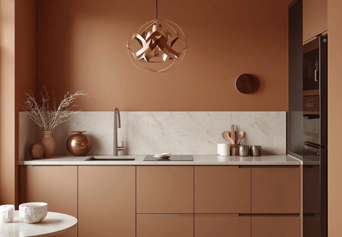
Orange for Warmth and Vitality
Orange naturally connects with the fire element, so it fits comfortably within Vastu thinking. It brings vibrancy to the kitchen and often works well in homes where the cooking area is meant to feel warm and family-oriented.
Why do many people choose it:
- It carries a sense of enthusiasm and warmth
- It suits the purpose of the kitchen
- It can make the room feel energetic without looking chaotic
- It pairs nicely with cream, white, and wood finishes
White for Purity and Cleanliness
White continues to be one of the safest options in kitchen colour Vastu planning. It gives the room a clean and settled appearance and works with almost every interior style. It also often appears in small kitchen design ideas because it helps compact spaces feel more open and breathable.
Its appeal lies in the fact that it:
- Suggests neatness and simplicity
- Makes smaller kitchens look more open
- Reflects natural and artificial light
- Works easily with different cabinet and flooring choices
Peach for Soft Warmth and Harmony
Peach is often chosen by homeowners who want a warmer kitchen but do not want very strong colours. It feels gentle, familiar, and easy on the eyes.
Why it works well:
- It adds softness without making the room flat
- It creates a welcoming look
- It balances warmth with comfort
- It suits both traditional and modern kitchens
Cream for Elegance and Calmness
Cream is a dependable shade for kitchens because it looks neat, warm, and quietly refined. It is one of those colours that rarely feels excessive.
Many homeowners prefer cream because it:
- Keeps the kitchen looking bright
- Feels softer than plain white
- Matches wood, beige, and pastel tones easily
- Creates a calm and balanced finish
Beige for Stability and Comfort
Beige is a grounding shade that works well in kitchens where the design needs to feel subtle and settled. It is especially useful when the kitchen opens into a dining area or living space.
It is valued because:
- It gives the room a stable visual base
- It feels warm without being loud
- It blends well with neutral interiors
- It supports a balanced overall palette
Light Grey for Modern Balance and Sophistication
Light grey is a more current design choice. While very dark grey is usually avoided, a pale grey can work when combined with warmer tones and enough natural light. It also fits well in homes inspired by smart modular kitchen ideas, especially when paired with wood and white finishes.
It may suit the kitchen because:
- It offers a clean and modern appearance
- It acts as a neutral balancing shade
- It works well with white, wood, and cream
- It gives the kitchen a polished look
Colours to Avoid in the Kitchen as per Vastu
Not every attractive colour is considered suitable for the kitchen under Vastu principles. Some shades are commonly avoided because they may clash with the room’s elemental nature.
Avoid Black and Dark Grey
Black and dark grey can make the kitchen feel heavy and closed. In spaces that already receive limited light, these colours may make the room appear dull and visually restricted.
They are generally avoided because:
- They absorb light
- They can reduce the sense of freshness
- They may create a dense, serious mood
Avoid Deep Blue
Deep blue can make a kitchen feel cooler and less inviting. In Vastu, blue is associated with the water element, which may not sit well with the fire element, which is associated with cooking and warmth.
It is generally avoided because:
- It represents the water element, which can clash with fire energy
- It may reduce the warm, active feel a kitchen needs
- It can make the space look darker and more closed, especially in compact kitchens
Match Colours With Kitchen Direction
Direction matters in Vastu, so colour choice can be more effective when matched to the kitchen's placement.
West-Facing Kitchen Colours
West-facing kitchens often respond well to earthy, soft, warm tones. Shades such as beige, cream, light brown, and gentle yellow can help the room feel stable and comfortable.
Southeast Kitchen Colours
The southeast is widely regarded as the ideal direction for a kitchen because it is linked to Agni. For that reason, the southeast kitchen colour as per Vastu generally includes warm tones that reflect fire without becoming too bold. These shades can also support bright kitchen décor when balanced with neutral cabinets and clean surfaces.
North-Facing Kitchen
North-facing kitchens usually benefit from lighter shades that keep the room bright. Cream, soft yellow, off-white, and light green can all help the space feel more open and pleasant.
Tips to Enhance Positive Energy With Kitchen Colours
Choosing the wall shade is only one part of the process. The final result depends just as much on light, finish, and coordination with other surfaces.
Use Natural Light and Ventilation
Good daylight enhances how the wall paint appears. Ventilation also keeps the room feeling fresh, which supports the effect of suitable colours. A few useful Vastu tips for kitchen planning include checking paint samples in daylight, avoiding overly dull tones in compact spaces, and choosing finishes that are easy to maintain in a working kitchen.
Matching Wall Colours With Cabinets and Flooring
A balanced kitchen looks better when the walls, cabinets, and flooring belong to the same visual family. Warm walls often pair nicely with neutral cabinets, while wood textures usually sit comfortably with cream, beige, yellow, or peach. This becomes even more important during a kitchen renovation with wooden cabinet finishes, where the paint and grain tones should complement each other rather than compete.
Creating a Harmonious Kitchen With Vastu Colours
Vastu-friendly kitchen colours should feel natural, not forced. Aim for a bright, balanced space using yellow, peach, cream, beige, white, or soft orange. When repainting, consider direction, daylight, cabinet shades, and room size.
To make the process easier and more efficient, Berger Express painting services offers expert guidance, quick execution, and high-quality finishes. Hence, your kitchen gets a Vastu-compliant colour makeover without unnecessary hassle. The right colour choice keeps the kitchen polished, welcoming, and comfortable for everyday Indian living.